


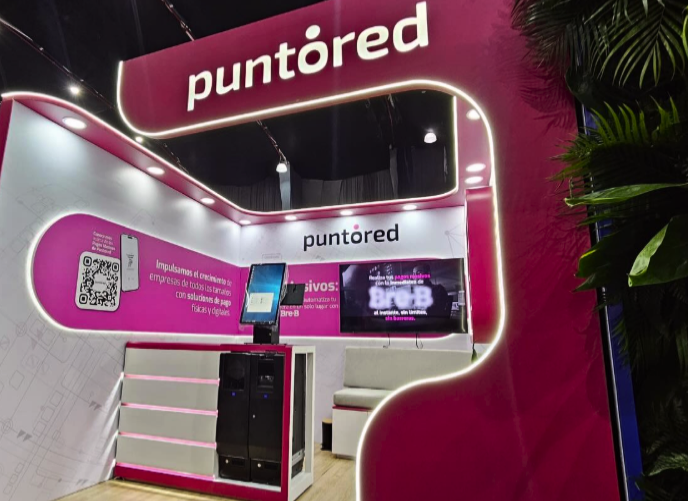
Puntored
Fintech platform
Readapting an entire design system
Shaping a visual identity after a brand merger
Role: Product Designer • Period: 2023
01. Context
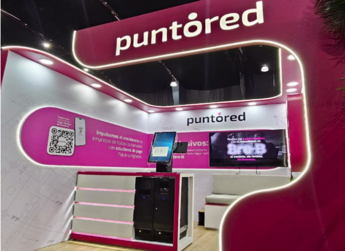
PUNTORED is a company with operations in Colombia and Mexico, offering large-scale financial solutions.
After participating in the financing of VECI, PUNTORED absorbed this product and decided to integrate it into its corporate ecosystem.
This implied:
- Brand migration
- Design system adaptation
- Flow Reconfiguration
- Adjustment to corporate standards
- Regional scalability
02. The challenge
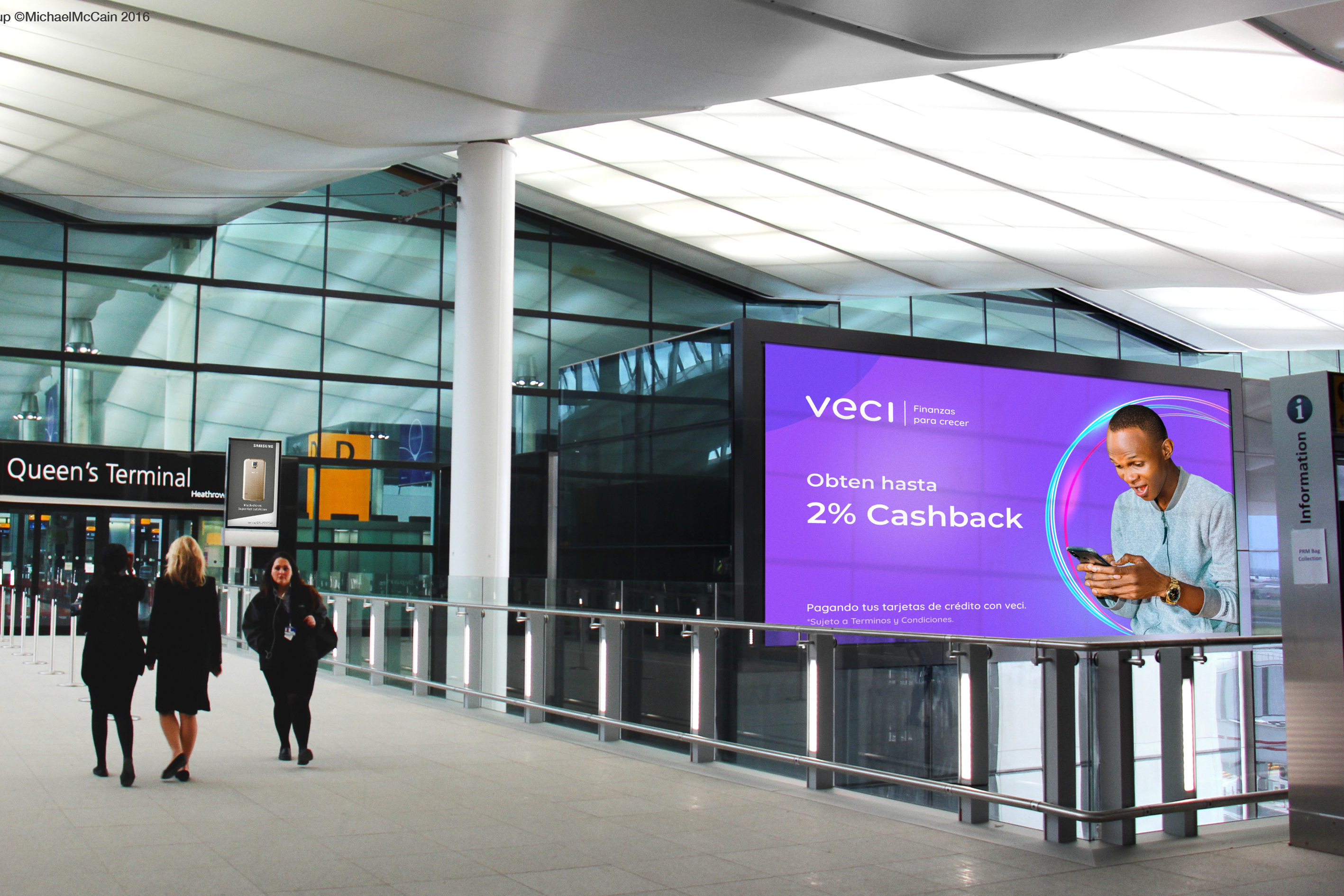
VECI had an identity:
Close
Popular
Friendly
Neighborly

PUNTORED was:
Corporate
Formal
Institutional
More regulated
That means:
It wasn't just changing colors and typography.It was to translate an agile startup product into a corporate environment without losing efficiency.
03. Transformation strategy
We decided not to “burn everything and remake.” Instead an incremental migration was done:
- The Design System was redefined in line with the new brand.
- The flows were then progressively adapted.
- Functional architecture was maintained when it was efficient.
- Inherited inconsistencies were optimized.
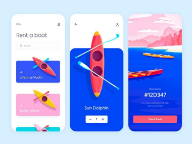
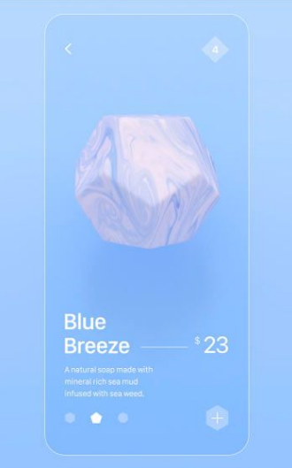
Input
Veci first design system
Examples of Veci interfaces
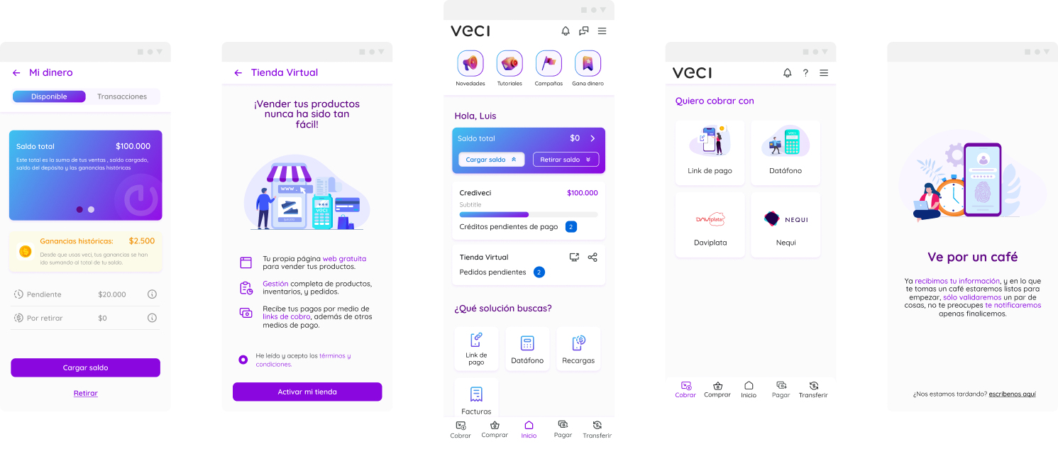
Visual Identification Methodology:
We put together a proposal to adapt the existing elements to the brand system, choosing visual and graphic characteristics that will be applied to the interfaces to guarantee consistency.
Proposal focused on:
Geometry
Iconography
Image
Illustration
Iconography
Geometry
Image
Illustration
With structure:
Organic
Full solid
Modular
Full solid structure
Organic structure
Modular structure
Images
Photography
Illustration

Color code
Monochromatic
Duotone
Full color

Iconography
Linear
Filling

Customization
Icon style
Centered on
Iconography
Structure
Modular
Style
Futuristic
Iconography
100% Linear
Color code
Duotone
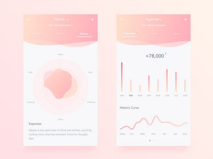
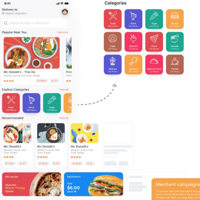
Output
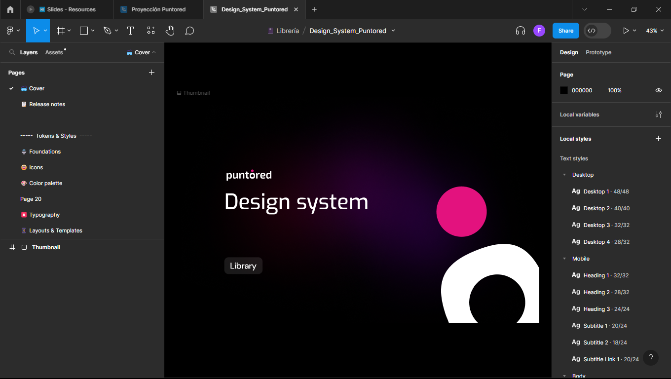
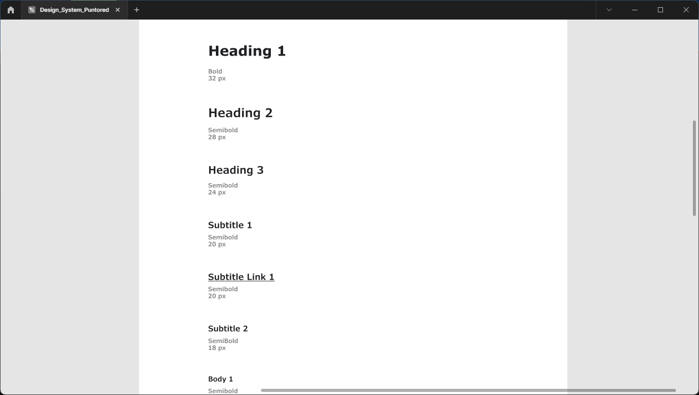
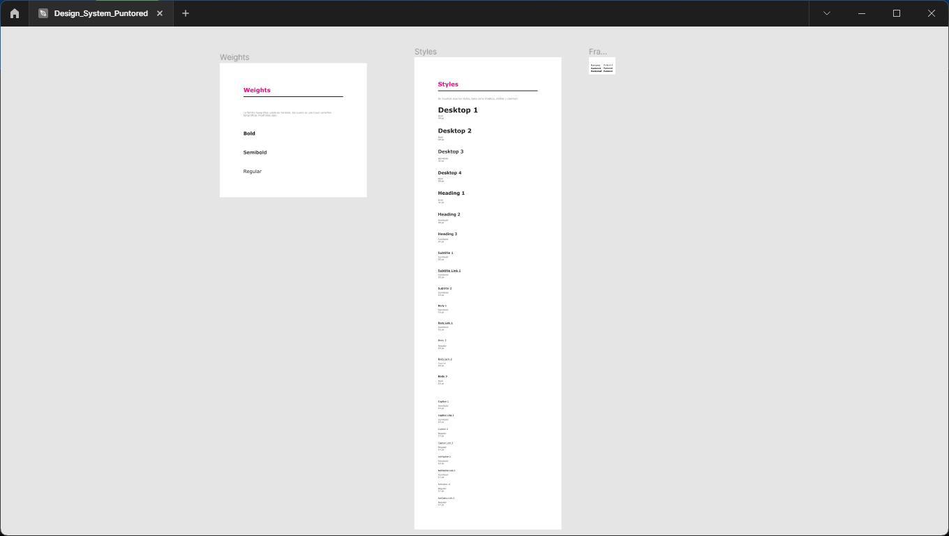
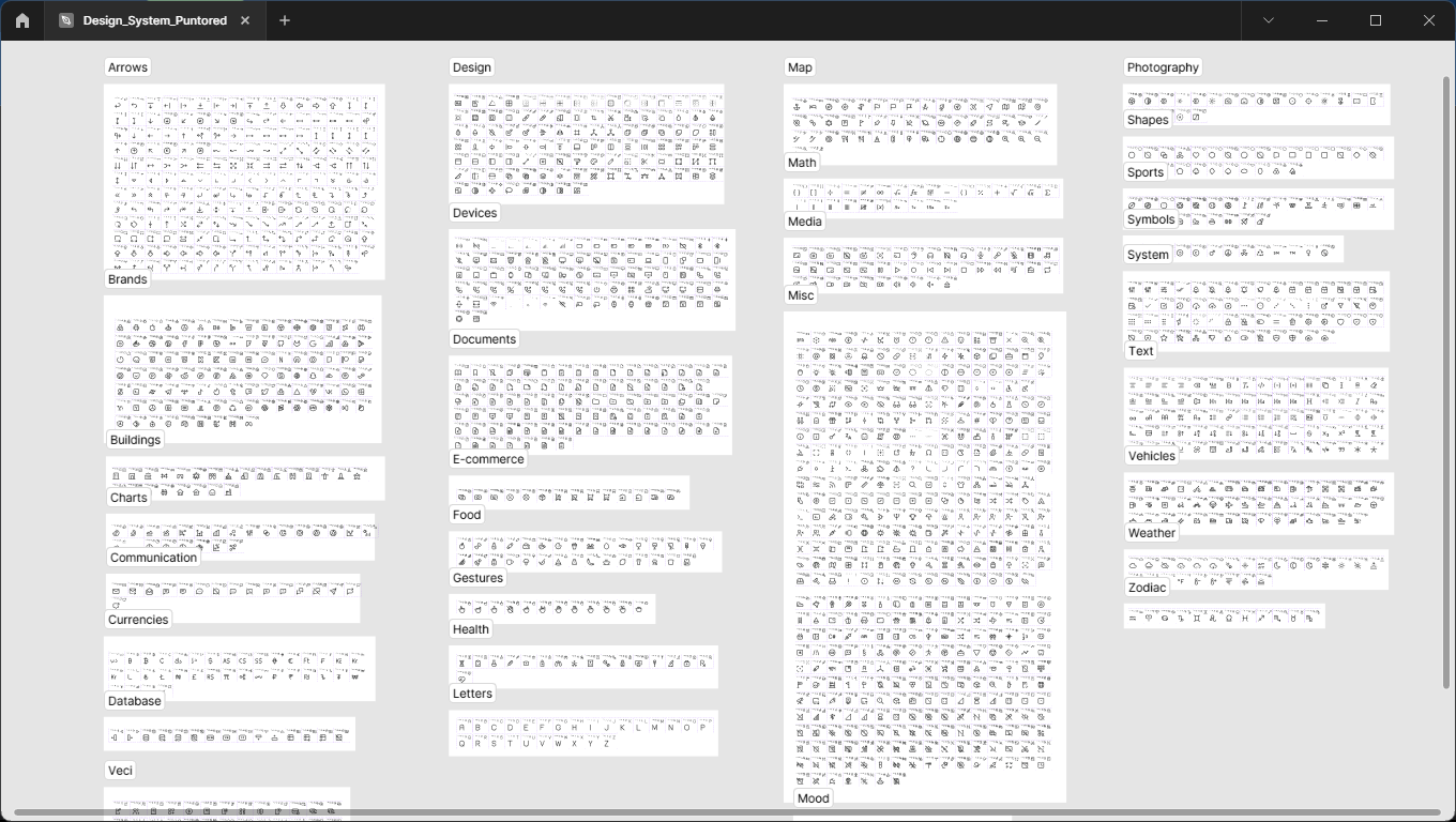
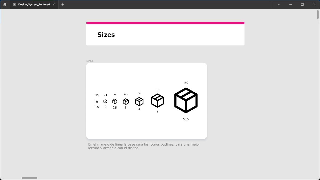
New Puntored design system
New color system
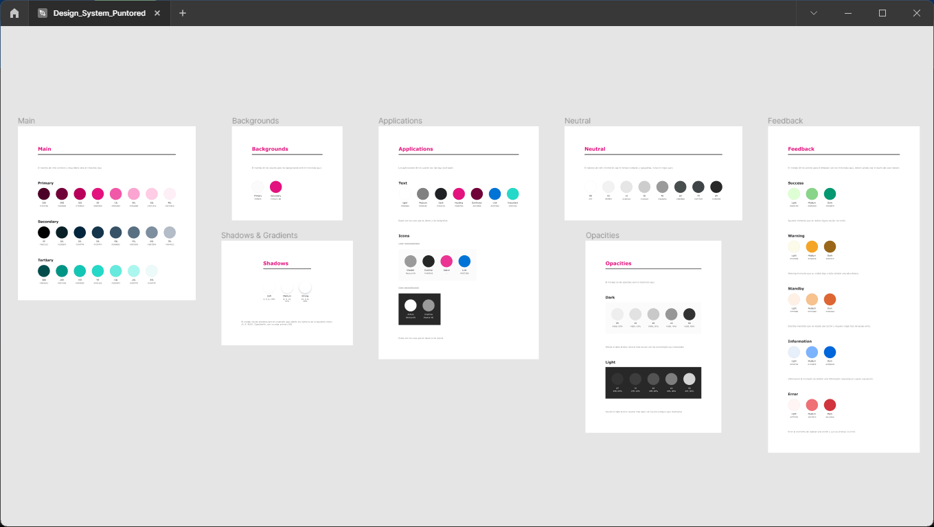
New font system
New icon system
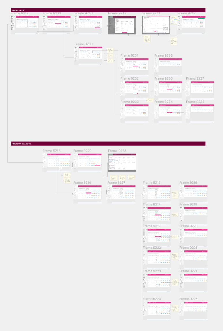
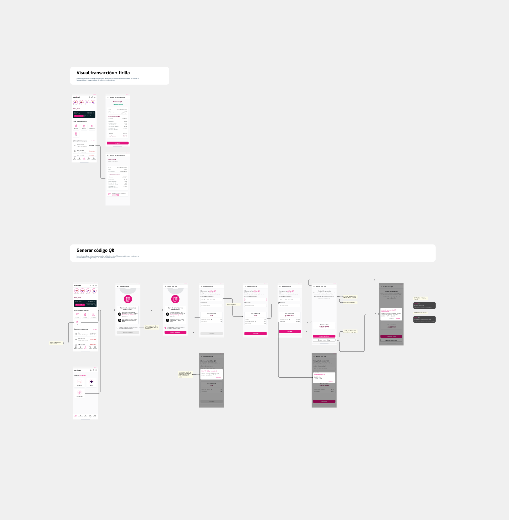
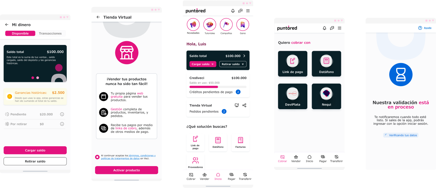
New user flow system
Examples of new puntored interfaces
04. Main Result
The transition avoided the classic acquisition risk: breaking up existing experience.

The result:
- Integration between cross-functional teams (~20 people).
- Greater visual coherence.
- Better alignment with corporate standards.
- Greater future speed of implementation.
- Solid foundation for expansion in Mexico.
Impact:
- Visual and functional unification of the ecosystem.
- Significant frictionless integration for existing users.
- Scalability for multiple markets.
- User base expanded by 30%.
- Lead migrations without generating massive debt.
Thanks for reading

BACK TO Projects


Puntored
Fintech platform
Readapting an entire design system
Shaping a visual identity after a brand merger
Role: Product Designer • Period: 2023
01. Context
PUNTORED is a company with operations in Colombia and Mexico, offering large-scale financial solutions.
After participating in the financing of VECI, PUNTORED absorbed this product and decided to integrate it into its corporate ecosystem.
This implied:
- Brand migration
- Design system adaptation
- Flow Reconfiguration
- Adjustment to corporate standards
- Regional scalability
02. The challenge
VECI had an identity:
Close
Popular
Friendly
Neighborly
PUNTORED was:
Corporate
Formal
Institutional
More regulated
That means:
It wasn't just changing colors and typography.It was to translate an agile startup product into a corporate environment without losing efficiency.
03. Transformation strategy
We decided not to “burn everything and remake.” Instead an incremental migration was done:
- The Design System was redefined in line with the new brand.
- The flows were then progressively adapted.
- Functional architecture was maintained when it was efficient.
- Inherited inconsistencies were optimized.
Input
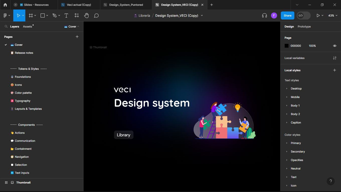
Veci first design system
Examples of Veci interfaces
Visual Identification Methodology:
We put together a proposal to adapt the existing elements to the brand system, choosing visual and graphic characteristics that will be applied to the interfaces to guarantee consistency.
Proposal focused on:
Geometry
Iconography
Image
Illustration
Iconography
Geometry
Image
Illustration
With structure:
Organic
Full solid
Modular
Full solid structure
Organic structure
Modular structure
Images
Photography
Illustration

Color code
Monochromatic
Duotone
Full color

Iconography
Linear
Filling

Customization
Icon style
Centered on
Iconography
Structure
Modular
Style
Futuristic
Iconography
100% Linear
Color code
Duotone
Output
New Puntored design system
New color system
New font system
New icon system
New user flow system
Examples of new puntored interfaces
04. Main Result
The transition avoided the classic acquisition risk: breaking up existing experience.
The result:
- Integration between cross-functional teams (~20 people).
- Greater visual coherence.
- Better alignment with corporate standards.
- Greater future speed of implementation.
- Solid foundation for expansion in Mexico.
Impact:
- Visual and functional unification of the ecosystem.
- Significant frictionless integration for existing users.
- Scalability for multiple markets.
- User base expanded by 30%.
- Lead migrations without generating massive debt.
Thanks for reading

BACK TO Projects


Puntored
Fintech platform
Readapting an entire design system
Shaping a visual identity after a brand merger
Role: Product Designer • Period: 2023
01. Context
PUNTORED is a company with operations in Colombia and Mexico, offering large-scale financial solutions.
After participating in the financing of VECI, PUNTORED absorbed this product and decided to integrate it into its corporate ecosystem.
This implied:
- Brand migration
- Design system adaptation
- Flow Reconfiguration
- Adjustment to corporate standards
- Regional scalability
02. The challenge
VECI had an identity:
Close
Popular
Friendly
Neighborly
PUNTORED was:
Corporate
Formal
Institutional
More regulated
That means:
It wasn't just changing colors and typography.It was to translate an agile startup product into a corporate environment without losing efficiency.
03. Transformation strategy
We decided not to “burn everything and remake.” Instead an incremental migration was done:
- The Design System was redefined in line with the new brand.
- The flows were then progressively adapted.
- Functional architecture was maintained when it was efficient.
- Inherited inconsistencies were optimized.
Input
Veci first design system
Examples of Veci interfaces
Visual Identification Methodology:
We put together a proposal to adapt the existing elements to the brand system, choosing visual and graphic characteristics that will be applied to the interfaces to guarantee consistency.
Proposal focused on:
Geometry
Iconography
Image
Illustration
Iconography
Geometry
Image
Illustration
With structure:
Organic
Full solid
Modular
Full solid structure
Organic structure
Modular structure
Images
Photography
Illustration

Color code
Monochromatic
Duotone
Full color

Iconography
Linear
Filling

Customization
Icon style
Centered on
Iconography
Structure
Modular
Style
Futuristic
Iconography
100% Linear
Color code
Duotone
Output
New Puntored design system
New color system
New font system
New icon system
New user flow system
Examples of new puntored interfaces
04. Main Result
The transition avoided the classic acquisition risk: breaking up existing experience.
The result:
- Integration between cross-functional teams (~20 people).
- Greater visual coherence.
- Better alignment with corporate standards.
- Greater future speed of implementation.
- Solid foundation for expansion in Mexico.
Impact:
- Visual and functional unification of the ecosystem.
- Significant frictionless integration for existing users.
- Scalability for multiple markets.
- User base expanded by 30%.
- Lead migrations without generating massive debt.
Thanks for reading
BACK TO Projects